
Pentagram's Paula Scher talks about her experience in the design world as well as her techniques, sources of inspiration and thoughts regarding artistic creation. Surprisingly down to earth for someone so talented.
Worth watching!
Via Edgar González.
Reasonable
A witty and well executed project by Carlos Rodríguez Torre.
 |
| 13 reasons for not being a graphic designer and 1 for being one. |
 |
| Reason nº1: The work. |
 |
| Reason nº2: The phone. |
 |
| Reason nº3: The caffeine. |
 |
| Reason nº4: The stress. |
 |
| Reason nº5: The trend. |
 |
| Reason nº6: The talent. |
 |
| Reason nº7: The sleep deprivation. |
 |
| Reason nº8: The subjectivity. |
 |
| Reason nº9: The lack of security. |
 |
| Reason nº10: The nightmares. |
 |
| Reason nº11: The color. |
 |
| Reason nº12: The composition. |
 |
| Reason nº13: The typography. |
 |
| The reason for being one. |
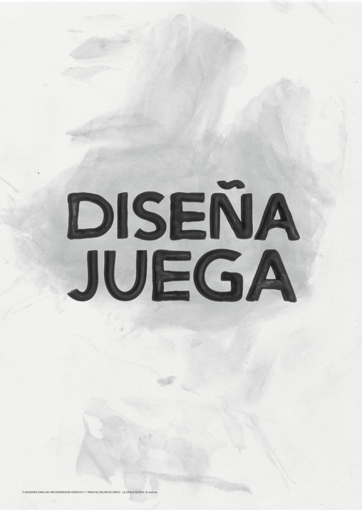 |
| The reason: the enjoyment. |
Via @beamoron.
35 mm
5/11/10
An amazing short film that summarizes 35 movies in just two minutes. Some of the stories it pays tribute to are A clockwork orange, The battleship Potemkin, The fight club, North by northwest or Toy Story. Worth watching and guessing!
By Sarah Biermann, Torsten Strer, Felix Meyer & Pascal Monaco.
And a rip off of the same concept that isn't as brilliant and homages less classic films.
Via Vimeo.
35mm from Pascal Monaco on Vimeo.
By Sarah Biermann, Torsten Strer, Felix Meyer & Pascal Monaco.
And a rip off of the same concept that isn't as brilliant and homages less classic films.
Via Vimeo.
Shadowplay studio
1/2/10
Some of the best title credits we've been able to watch in the last few years have been created by Shadowplay studio. An L.A. based studio whose projects span from title credits to video game cinematics, advertising and other kinds of motion graphics. One of their best skills is mixing video or photographic imagery with drawings and doodles. Worth a look.
Here are a few examples:
Thank you for smoking (2005)
Juno (2007)
And their latest work: Up in the air (2009).
Here are a few examples:
Thank you for smoking (2005)
Juno (2007)
And their latest work: Up in the air (2009).
The beauty of decadence
29/1/10
I recently had the chance to get to know Artificial Owl, a site that features photographs of all kinds of abandoned bulidings, objects and facilities. Some of the images reminded me of the gorgeous work about Chernobyl from Nadav Kander.


Talent from sunny California
7/7/09
Justin Harder's motion graphics are bold, dynamic and totally integrated with the media that showcases them. What makes them so special might be that no matter what graphic language he chooses to use his color palettes, compositions and typographic elements are always eye-catching and fulfill their communication purposes. No wonder why brands such as MTV, Coca-Cola, VH1, Fox or Bud have entrusted him with their commercials, teasers, videos, title credits and everything in between.
This reel is just a small part of his work, you should check out the rest of it here.
This reel is just a small part of his work, you should check out the rest of it here.
Via Serial cut's links.
Bitter Kas by Morera design
27/6/09
It seems that lately using glass packaging in order to sell premium water is becoming a huge trend. Examples of this are the award winning Solan de cabras water bottle designed by Jaime Lacasa or brands such as Voss or Tasmanian rain.
Following that trend and with a similar amount of success, the new Bitter Kas packaging by Morera design has recently been released. It sure is a great way to modernize a drink by taking into account its pharmacologist's and herbal background as well as featuring the drink's color as the main element of the redesign.

Via Neo2
Florian Hardwig and Malte Kaune
26/5/09
Some days ago Florian Hardwig helped me out with a typographic issue on typophile. As I was finding the way to contact him I came across his (and Malte Kaune's) gorgeous portfolio and I have to say that it was quite a surprise. The use of typography is one of the best I've seen lately as well as the handling of colour and composition. Here are a few examples but you should see all the work in context right here.


Suscribirse a:
Entradas (Atom)


